How cool is this?
We just recieved an order for 40 gallons of Daly's SeaFin Teak Oil to be shiped to a marine business in Egypt.
Tuesday, October 24, 2006
Monday, October 23, 2006
Help Wanted!!!!
We are looking for interesting, responsible, articulate, multi-tasking, outgoing, colorful people to work at our company!!
On the surface our job might look like a typical retail sales position, but in reality you are helping people make choices that mean a lot for their homes. I like to think we are in the business of making people happy - how cool is that? Way better than simply selling someone a meaningless "thing"... It's rather interesting and rarely dull or boring...
If you know someone who would like to work at Daly's email linda@dalyspaint.com or stop in and fill out a job app.
Sunday, October 22, 2006
Creativity
This painting class has gotten me to think about creativity in all sorts of ways (thus the Project Runway addiction!). Color, design, the act of actually creating versus just thinking about doing something.
So Friday was a stupendous Seattle fall day - so beautiful in fact that I just couldn't haul my behind into the gym after my painting class. Instead I decided to walk around Greenlake, Seattle's version of Central Park.
What a great idea this turned out to be. As I was just about ready to turn around and go home, I ran into someone that I hadn't seen for years and who has created living based on his creativity. He's Kim Hall, the older brother of a friend I had hung out with during my early years of college - back then I remember a musical instrument he made out of varying sizes of metal hip replacement joints. Visualize a xylophone-type instrument, and you start getting the picture of his sense of humor and creativity. As I recall, it actually sounded pretty good.
If you are from Seattle, you might recognize Kim from his bicycle that he regularly rides around Greenlake... He is perched about 5 feet off the ground, trust me, you can't miss him! I still haven't figured out how he gets atop that thing.
Check out Kim's website for a shot of inspiration on a scale a bit larger than most of us operate within... Pretty cool stuff...
One more thing - his official job title - "big important sculptor".
Thursday, October 19, 2006
Project Runway Finale
Did anyone else watch the Project Runway finale last night???
I had a sinking suspicion that Jeffrey would come out the winner. His punk attitude and approach gives his clothes a edgier personality.
BUT - I wanted to wear Laura's clothes! I really did. I wanted that swingy beading at the hem my cocktail dress. Not so much the feathers on the shoulders, but ohmygod the beaded evening gown with the acid green belt? LOVED IT! I wish she had kept the coat that she was working on in the episode where Tim visited her at home. I thought the color was so fresh, myself.
I was impressed with Uli's constrained use of palette and pattern. However I really was not fond of the combination of silver accents on the khaki-beige fabrics. Gick. I thought her choice of music was very fitting and supported the visuals.
Michael's clothes were too testosterone-based. A man's idea of what a "hot" woman would wear to show off her body. Thank God he didn't send that scary white shirt with the gold sequined pockets down the runway! It reminded me of those oversized shirts women wore with leggings in 1992!
The newspaper said that Seattle was one of the biggest markets for the show. Pretty funny considering our polarfleece reputation!
Wednesday, October 18, 2006
Responsibility
As a customer, how much responsibility do you take to make sure your home project turns out correctly?
Do you try colors on the wall before painting the whole room?
Do you check to see if your painter is licensed, bonded, insured AND has a good reputation? Would you hire then, even if you didn't communicate well? What if they are fine people, but you just don't "connect"?
Do you take advice blindly, even for your own home? Do you filter it through your own set of values?
Who is responsible if you don't like something? Let's say it performs well but you just don't like it? Is it the paint stores fault for selling it to you?
These things drive me nuts sometimes.
Store Business
I've been focusing on some store issues recently.
The Seattle Dept. of Transportation (SDOT) is looking into giving Stone Way (the street on which our Seattle store is located) something called a Road Diet. This means converting a 4 lane road into a 2 lane road with a turn lane in the center. Plus the addition of bike lanes in both directions.
On the surface it sounds like a change that would make the road more attractive, however the lower half of Stone Way is zoned industrial, and I think the changes would negatively affect business operations. However, we all agree that we want pedestrians to feel safe, too. There is a garbage transfer station less than 2 blocks away, and they have these behemoth freight-sized trucks of trash being hauled up Stone all the time. Imagine being stuck behind one of these babies for over half a mile at 15 mph.... Not my idea of a good solution.
There are neighboring businesses that unload their freight right on Stone. With a Road Diet solution, they'd be forced to unload in the center turn lane and cross traffic on foot or with forklifts to move merchandise and supplies. How safe is that? Or practical?
Not.
Have also been thinking about rebuilding the 30+ year old wallpaper book bins. I want the showroom to have a bit of a design studio feeling - so when customers bring in their projects they can really have a sense of creativity. We have such great windows, literally floor to ceiling -a studio concept would be so cool.
Monday, October 16, 2006
Color Influences
So I've been thinking about color palettes lately. Both for the canvas and for the home.
I just started an oil-painting class a couple weeks ago, something I've not really had much personal experience using. I have always had acrylics on hand, but never oils. I took one art class in high school, and the instructor was less than inspirational. I think I accomplished one painting - of a wall and outlet. Pretty boring stuff, and Mr Hoy didn't give us any help in how to use the paints, composition, or really anything. He was cranky most of the time.
I learned more about the concepts of design in my high school yearbook class. We learned about the Golden Mean, balance and proportion, the value of white space and meeting deadlines (if you don't think deadlines are important to interior design, try missing the installation of those draperies before the Big Party!)
When I was in college, I took a painting class, and we used acrylics. Then, I felt that to be an art major, you had to have burning issues or extreme points-of-view to express to be a legitimate artist. These days, not so much. Who has time to care so much about what others think of your stuff? I like that freedom.
Anyways - color palettes. First I got into a conversation with my friend Philip about full-spectrum colors, then I started this painting class where we don't even have a tube of black amongst our collection of colors. Confirms Philip's perspective.
THEN, I started looking at the latest Vanity Fair magazine. After reading Dominic Du nne's column (always my first stop!), I started noticing the advertisements. And then I was literally swept away by a photo of the set of Sophia Coppola's new movie, Marie Antoinette. I want to see it just for the lush colors! Ohmygod, I they looked so beautiful! What a gorgeous contrast compared to all the heavy browns and neo-70's colors we've been seeing so much of lately. So refreshing!
Of course there's the tiny little issue of the French Revolution...
I just started an oil-painting class a couple weeks ago, something I've not really had much personal experience using. I have always had acrylics on hand, but never oils. I took one art class in high school, and the instructor was less than inspirational. I think I accomplished one painting - of a wall and outlet. Pretty boring stuff, and Mr Hoy didn't give us any help in how to use the paints, composition, or really anything. He was cranky most of the time.
I learned more about the concepts of design in my high school yearbook class. We learned about the Golden Mean, balance and proportion, the value of white space and meeting deadlines (if you don't think deadlines are important to interior design, try missing the installation of those draperies before the Big Party!)
When I was in college, I took a painting class, and we used acrylics. Then, I felt that to be an art major, you had to have burning issues or extreme points-of-view to express to be a legitimate artist. These days, not so much. Who has time to care so much about what others think of your stuff? I like that freedom.
Anyways - color palettes. First I got into a conversation with my friend Philip about full-spectrum colors, then I started this painting class where we don't even have a tube of black amongst our collection of colors. Confirms Philip's perspective.
THEN, I started looking at the latest Vanity Fair magazine. After reading Dominic Du
 nne's column (always my first stop!), I started noticing the advertisements. And then I was literally swept away by a photo of the set of Sophia Coppola's new movie, Marie Antoinette. I want to see it just for the lush colors! Ohmygod, I they looked so beautiful! What a gorgeous contrast compared to all the heavy browns and neo-70's colors we've been seeing so much of lately. So refreshing!
Of course there's the tiny little issue of the French Revolution...
Thursday, October 12, 2006
Sometimes Nice Things Happen
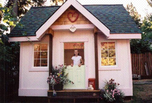
This is Sophie's Playhouse. It was built by volunteers for the Make-A-Wish Foundation. Daly's was happy to supply the perfect shade of pink paint needed to make it feel like home!
Done!

Here is the benefit table that we created from our Thrift Store adventures. We called it "Camelot for Not-A-Lot". A wedding brunch for Jackie and John Kennedy.
- Thrift store pearls dripping from vintage champagne glasses
- One of the glasses was inscribes "Bride, another "Mother of the Bride"
- Classic 60's buffet plates
- Silverware with major patina
- Romantic rose petals (faux) tossed over the surface of the table
- Tons of polished silverplate dishes, platters, containers
- Pink tablecloths trimmed with black tassels
- Black and white wedding photos of Jackie and John at each placesetting
While we didn't win (rats!) we felt very good about our table. Unlike some other tables at the function, ours didn't look like a store display of current mechandise off the sales floor - we actually put some thought and creativity behind our presentation!
Our shameless splurge? We bought NEW tapers - the clearance ones we were originally planning to use were simply too ugly! And the champagne is real - it goes to the lucky winner who won a consultation with Christian and I... maybe she'll share!
Tuesday, October 03, 2006
Seeing Color in a Whole Old Way

I had a great conversation with my friend Philip Reno yesterday. He has designed his own palette of paint colors that he calls "Philip's Perfect Colors" (available exclusively at G&R Paint in San Francisco). The concept that supports the entire palette is that each color is created using the full spectrum of tints - he uses compliments (opposite colors on the color wheel) to "tone" the colors instead of using black.
In the architectural coatings world, most paints have maybe three tints in them to make most colors. By using full spectrum formulations, there are usually a lot more colorants in each color. This makes the paint color read very differently in a variety of lighting conditions.
 So, back to Philip. Last week he gave a Continuing Education presentation to over 200 Interior Designers in Boston. I imagine all these designers are now running around to their favorite paint stores requesting that their colors be tinted as full-spectrum colors... Think of the colors the Old Masters, like Leonardo and Botticelli, used to create their art. They employed the same concept for their paintings - using compliments to make their colors appear rich and luminous. Philip believes these colors are part of our consciousness and that they never go out of style.
Philip had some of his colors published recently in House Beautiful. Gorgeous!
Subscribe to:
Posts (Atom)