Wednesday, December 27, 2006
Winter Holiday


Tuesday, December 19, 2006
The Power of Paint
People will come into a paint store looking to buy product - even if there is no electricity in that store! Not only that, but they will try to choose paint colors in the dark.
Our Bellevue store was only down for a day, luckily, but even so, we had a smattering of traffic. To sell paint, you need electricity to tint and shake the stuff. On Friday (day of no power), we actually sold white primer and white paint - only color where you DON'T need power!
I don't know if they thought they might try and kill a few hours by painting at home, since there was nothing else to do.... but it was too cold even for that.
 Our production factory flooded in a major way. There was nothing to do (besides unplug everything) except wait until the storm subsided. Water was literally GUSHING in from a drain spout. Water covered the complete basement floor. Thankfully, our finished goods are stored on palettes and raised shelves, they escaped unharmed.
Monday, December 11, 2006
Weekend Party Preparations
I get to create a story around all the different employee photos we've collected over the year. But I haven't really started yet - I am searching for a theme... Last year it was a tour of Dalysnorts School of Witchraft and Wizardry. This year??? Wish me luck!
Thursday, December 07, 2006
My Brain Hurts
There is a lot out there. My brain hurts.
Wednesday, December 06, 2006
Amazing Lighting

Getting Ready for the Holidays
But, these two 4' trees are kinda cool. Plus they'd dress up the front door. I'll let you know if I actually do it. It depends on how they look in the store.
Speaking of real - we purchased our two Christmas trees last weekend. One for the family room, stuffed with kid decorations and the other for the living room with all types of crystal ornaments, birds and ephemera.
Yes, I'm picky about the trees (is this really a shock?). They have to be noble fir, the boughs are strong and there is room for ornaments to dangle between branches. I am a white light or single colored light fan, the multiple-colored lights are a concession for the family room - but even I admit they add a festive air to the kid tree!
Let the season glow.
Tuesday, November 28, 2006
What are readers searching for?
There are always cultural accents (but that just keeps our "language" fresh and interesting!), like white symbolizing purity in the West and death in the East - but for the most part, color needs few words to understand. Here are a few quick examples:
- Red - means passion, either in love or anger
- Blue - is calming or can mean depressing
- Yellow - ranging from life giving and energetic to extreme edginess
Both positive and negative emotions are tied in with color and how they affect us both physically and emotionally.
One reason we are looking for direction with color is that is EVERYWHERE. In the design related field, it is part of every single choice we need to make for our homes. This can be stressful, because even switchplates have color choices! So many choices can become overwhelming.
On the other hand, color choices give us a lot of control over our environment and we can help to create the feelings we want gain from our environment. Paint is the perfect example here: You can change the nature of a room by simply changing the color on the walls. It's also one of the cheapest design tools - a $40 bucket of paint goes a lot further to transforming a space than a $40 yard of fabric. Both the fabric and the paint do have a commonality: one of the basic elements we of how we relate to both is via their color.
What colors turn you on? I find that my personal paint color palatte for my home is become both lighter and muckier (these are not exactly mutually exclusive characteristics) - heavy colors aren't making my heart soar, right now. Neither are colors that are too, well, colorful. I suppose we could call them saturated, but the effect is that they are too colorful and distracting from the activity going on in the room.
Saturday, November 25, 2006
Attention to Details

Interesting Question
If Han Solo and Jack Sparrow were engaged in hand-to-hand combat - who would win???
While we were contemplating this, we came up with another character dilemma with no clear answer:
Who would win if Legolas was pitted against Will Turner?
See what I mean, it's a dilemma!
Monday, November 20, 2006
The Mad Dash
Just a little more rolling in the kitchen and we'll be ready for the holidays. I didn't use one square inch of tape in the kitchen around the cupboards or moulding - no drips, no mess and it was quick! I guess that's what quality paints are supposed to do, but it's always nice when things perform as promised.
Wednesday, November 15, 2006
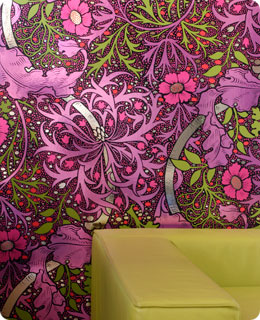
Cool Wallpaper Site
Monday, November 13, 2006
At Last!!!!!!
The kitchen has been a saga of sorts. You'd think with all my work with color that choosing my own would be a snap. Right? Well, the chocolate walls are not making me a happy paint princess. A color might work just fine and still be wrong, that's the situation we have going on in the kitchen. I love to eat chocolate, but it's not so great for the north-facing kitchen.
Regarding the living room - much as it pains me to say this, it's true: Mom was right again!
She suggested a color to try for the living room, C2's Bamboo. While it's too dark, I had a C2 Sampler pint made of the formula at both 75% and 50% strength. I even had a 50% formulation made with no black pigment, just to see if the spectrophotometer could match to color accurately without using any black pigments.
It's great! I think my trick of eliminating the black pigment kept the lightened color from mushing out to a blechy greige tone. Sometimes lightened colors can loose their character and vibrancy when cut down too far. Then they become shades of grey on the wall. Or they look like "why bother" versions of the richer color - too safe and weakened from the original.
It looks great in both the living room AND the kitchen. Surprising about the kitchen, who knew the same color would look so great in both spaces? It's just a great color that supports all the millwork and furnishings - I love it. I might try lightening the living room formulation a tad more, maybe C2 Bamboo at about 40%... just a titch lighter... but even so, I really like the color a lot. It's quite neutral without resorting to safe beige. Lots of yellow/olive undertones, it's great. I can't wait to get it painted!
Who knows, maybe this color will even last in our house more than 6 months...
Tuesday, November 07, 2006
Help Wanted! Update
Back Again!
I've been rather busy, sorry I haven't called. Or written. Or emailed. Blah, blah, blah.
Before we get any further into it, I need to ask you, "Did you vote today?". Hope so.
I saw the finals on our Wood Stain labels! Final proofing is underway right now. I can't wait to show you how they look! Soooooooooo much better!
I spent the weekend in Chicago with a couple of my C2 partners. We closed down this great bar called Blue Chicago before finishing the evening at a pub (who's name I just can't recall!). I had to send almost all my travel clothes out to the cleaners - I forgot what decades of smoky bars does to an outfit.
Of course, we worked most of the weekend. We have a great marketing team, and we were planning our strategy for the next few years. I can't tell you what we have in the hopper, but let me just say that it's definitely going to be a "panty dropper" when we come out with our new initiatives. Yup. So cool. The designer in me screams, "I want it now!"
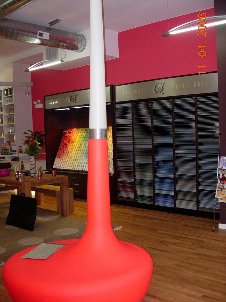
Speaking of cool, check out this paint store. It's called Colori Chicago and they exclusively sell C2 Paint, no other brand.
What I love about Colori, is that the owner, Michelle Herzog has NEVER owned a paint store before. So she doesn't come to the table with a lot of preconceived ideas about what will or won't work. For example, all her sundries are displayed in tote bins. So her shop looks more like a studio than a paint store. Why not?

She's gotten some great local press, and she is getting noticed. Which is great, because it's giving her some momentum to get her new baby off the ground.
We gave a Designer Presentation at Michelle's store on Saturday. I find those experiences very interesting. We have such a compelling story to share, and we get pretty deep into what happened, who the players are and why this affects the product we produce for our customers. It is so much more information than people are used to getting, I think - it's not just the surface "marketing" stuff, but the real story behind C2 Paint. Gets 'em every time.
Personally? I still haven't found my own color scheme for the living room and kitchen! But I'm getting closer...
Tuesday, October 24, 2006
SeaFin Rocks
We just recieved an order for 40 gallons of Daly's SeaFin Teak Oil to be shiped to a marine business in Egypt.
Monday, October 23, 2006
Help Wanted!!!!
On the surface our job might look like a typical retail sales position, but in reality you are helping people make choices that mean a lot for their homes. I like to think we are in the business of making people happy - how cool is that? Way better than simply selling someone a meaningless "thing"... It's rather interesting and rarely dull or boring...
If you know someone who would like to work at Daly's email linda@dalyspaint.com or stop in and fill out a job app.
Sunday, October 22, 2006
Creativity
So Friday was a stupendous Seattle fall day - so beautiful in fact that I just couldn't haul my behind into the gym after my painting class. Instead I decided to walk around Greenlake, Seattle's version of Central Park.
What a great idea this turned out to be. As I was just about ready to turn around and go home, I ran into someone that I hadn't seen for years and who has created living based on his creativity. He's Kim Hall, the older brother of a friend I had hung out with during my early years of college - back then I remember a musical instrument he made out of varying sizes of metal hip replacement joints. Visualize a xylophone-type instrument, and you start getting the picture of his sense of humor and creativity. As I recall, it actually sounded pretty good.
If you are from Seattle, you might recognize Kim from his bicycle that he regularly rides around Greenlake... He is perched about 5 feet off the ground, trust me, you can't miss him! I still haven't figured out how he gets atop that thing.
Check out Kim's website for a shot of inspiration on a scale a bit larger than most of us operate within... Pretty cool stuff...
One more thing - his official job title - "big important sculptor".
Thursday, October 19, 2006
Project Runway Finale
I had a sinking suspicion that Jeffrey would come out the winner. His punk attitude and approach gives his clothes a edgier personality.
BUT - I wanted to wear Laura's clothes! I really did. I wanted that swingy beading at the hem my cocktail dress. Not so much the feathers on the shoulders, but ohmygod the beaded evening gown with the acid green belt? LOVED IT! I wish she had kept the coat that she was working on in the episode where Tim visited her at home. I thought the color was so fresh, myself.
I was impressed with Uli's constrained use of palette and pattern. However I really was not fond of the combination of silver accents on the khaki-beige fabrics. Gick. I thought her choice of music was very fitting and supported the visuals.
Michael's clothes were too testosterone-based. A man's idea of what a "hot" woman would wear to show off her body. Thank God he didn't send that scary white shirt with the gold sequined pockets down the runway! It reminded me of those oversized shirts women wore with leggings in 1992!
The newspaper said that Seattle was one of the biggest markets for the show. Pretty funny considering our polarfleece reputation!
Wednesday, October 18, 2006
Responsibility
Do you try colors on the wall before painting the whole room?
Do you check to see if your painter is licensed, bonded, insured AND has a good reputation? Would you hire then, even if you didn't communicate well? What if they are fine people, but you just don't "connect"?
Do you take advice blindly, even for your own home? Do you filter it through your own set of values?
Who is responsible if you don't like something? Let's say it performs well but you just don't like it? Is it the paint stores fault for selling it to you?
These things drive me nuts sometimes.
Store Business
The Seattle Dept. of Transportation (SDOT) is looking into giving Stone Way (the street on which our Seattle store is located) something called a Road Diet. This means converting a 4 lane road into a 2 lane road with a turn lane in the center. Plus the addition of bike lanes in both directions.
On the surface it sounds like a change that would make the road more attractive, however the lower half of Stone Way is zoned industrial, and I think the changes would negatively affect business operations. However, we all agree that we want pedestrians to feel safe, too. There is a garbage transfer station less than 2 blocks away, and they have these behemoth freight-sized trucks of trash being hauled up Stone all the time. Imagine being stuck behind one of these babies for over half a mile at 15 mph.... Not my idea of a good solution.
There are neighboring businesses that unload their freight right on Stone. With a Road Diet solution, they'd be forced to unload in the center turn lane and cross traffic on foot or with forklifts to move merchandise and supplies. How safe is that? Or practical?
Not.
Have also been thinking about rebuilding the 30+ year old wallpaper book bins. I want the showroom to have a bit of a design studio feeling - so when customers bring in their projects they can really have a sense of creativity. We have such great windows, literally floor to ceiling -a studio concept would be so cool.


 Posts
Posts